[ Product Design · Aug 2023 - Nov 2023 ]
Global Search
Redesign
BOSS360 is where mortgage brokers live all day — every deal, every lead, every borrower's contact card, all in one place. The search box in the top corner was supposed to be the fast way to any of it. In practice, it had three specific problems.
That last problem is the one that shaped everything that followed: a name like "Priya Nakamura" might be a deal, a lead, and a contact all at once, and a flat list of matches can't tell those apart. This case study follows the search bar through four documented design-review rounds — each one visible in the project's own Figma history — from an ambitious query-builder down to the four-step flow that actually shipped.
Two directions, one header
The first pass tested two competing homes for search: an expanding panel inside the global header (V1), and a per-section mega-dropdown living under each nav tab (V2).
V1 treated search as a single conversation that gets more specific the longer you stay in it: type a letter, and recent lookups appear; keep typing, and matches group themselves by record type; ask for more, and an "Advanced Search" mode unlocks entity checkboxes and a column picker. Nine distinct states, all without leaving the header.
V2 took the opposite bet: instead of one omnisearch box, it moved search inside a "Views" mega-dropdown scoped to whichever nav tab you were already in — Search individual deals lived under Deals, not in the global header.
The query-builder — the high-water mark
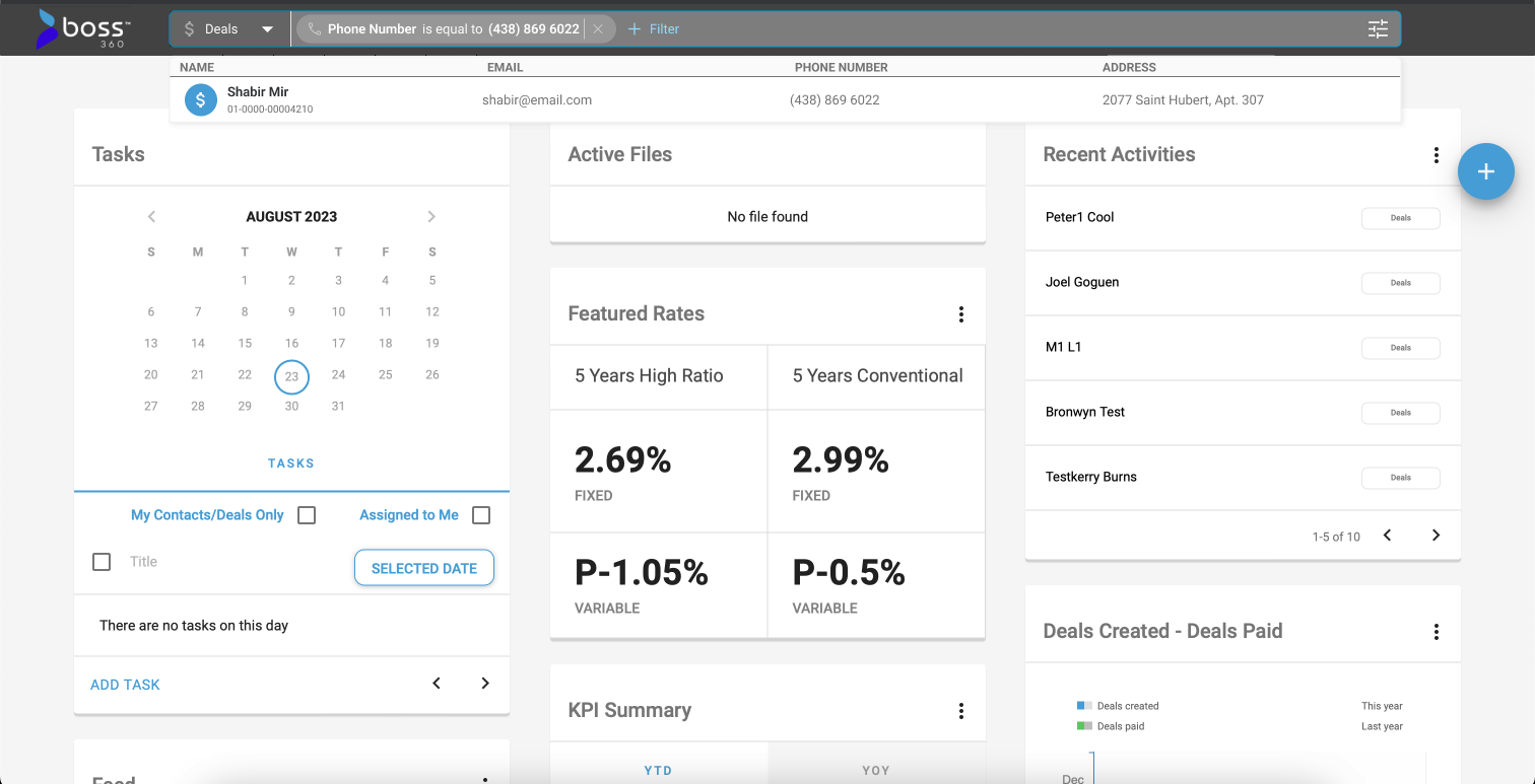
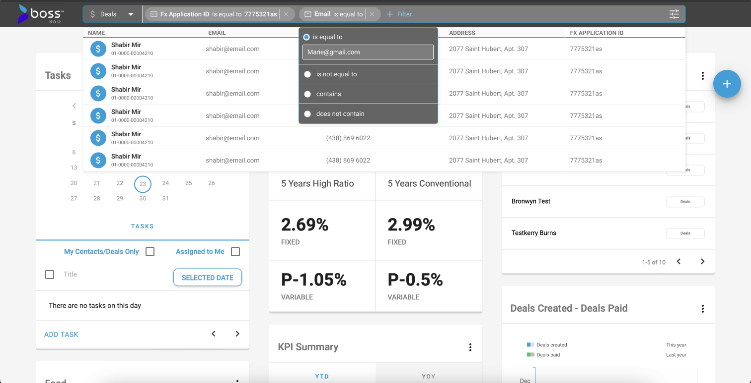
Checkboxes weren't precise enough. This round replaced them with filter chips borrowed from spreadsheet-style tools: pick a field, pick an operator, type a value — then chain a second one.
Engineering asks: what if there's only one answer?
The tech-team pass didn't touch the visual language — it stress-tested the logic. What does the panel do when a search term is unambiguous?
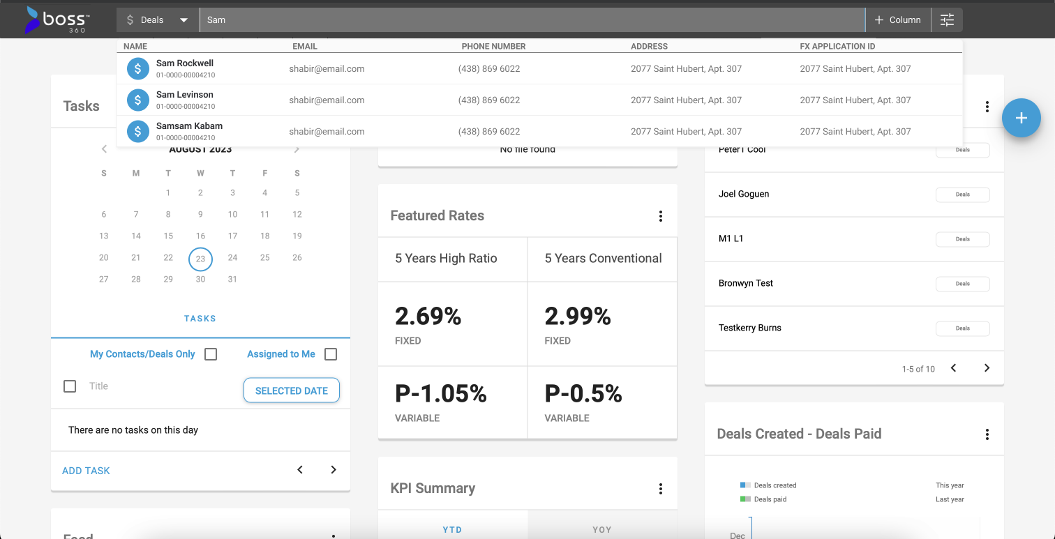
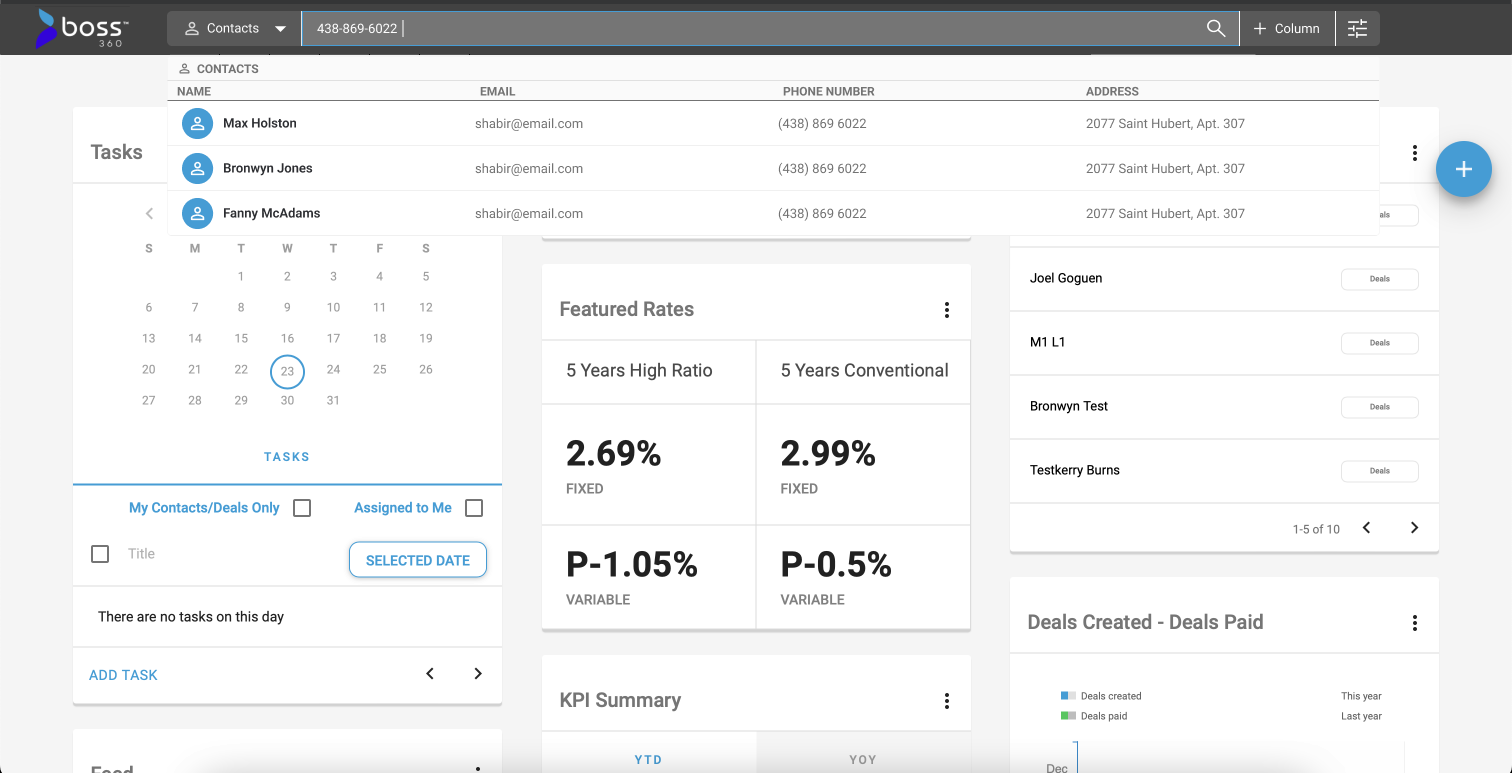
The category dropdown narrows to the one type that matched — no grouped breakdown needed.
This round also distilled everything built so far into a working component set: one search input, one category pill, one result row, one "+Column" control. Four pieces, reused across every state instead of one bespoke layout per screen.
One control per module, not one control for all
The last round before ship split the design into a Deal-module version and a Contact-module version, and grew the column picker into a real field library.
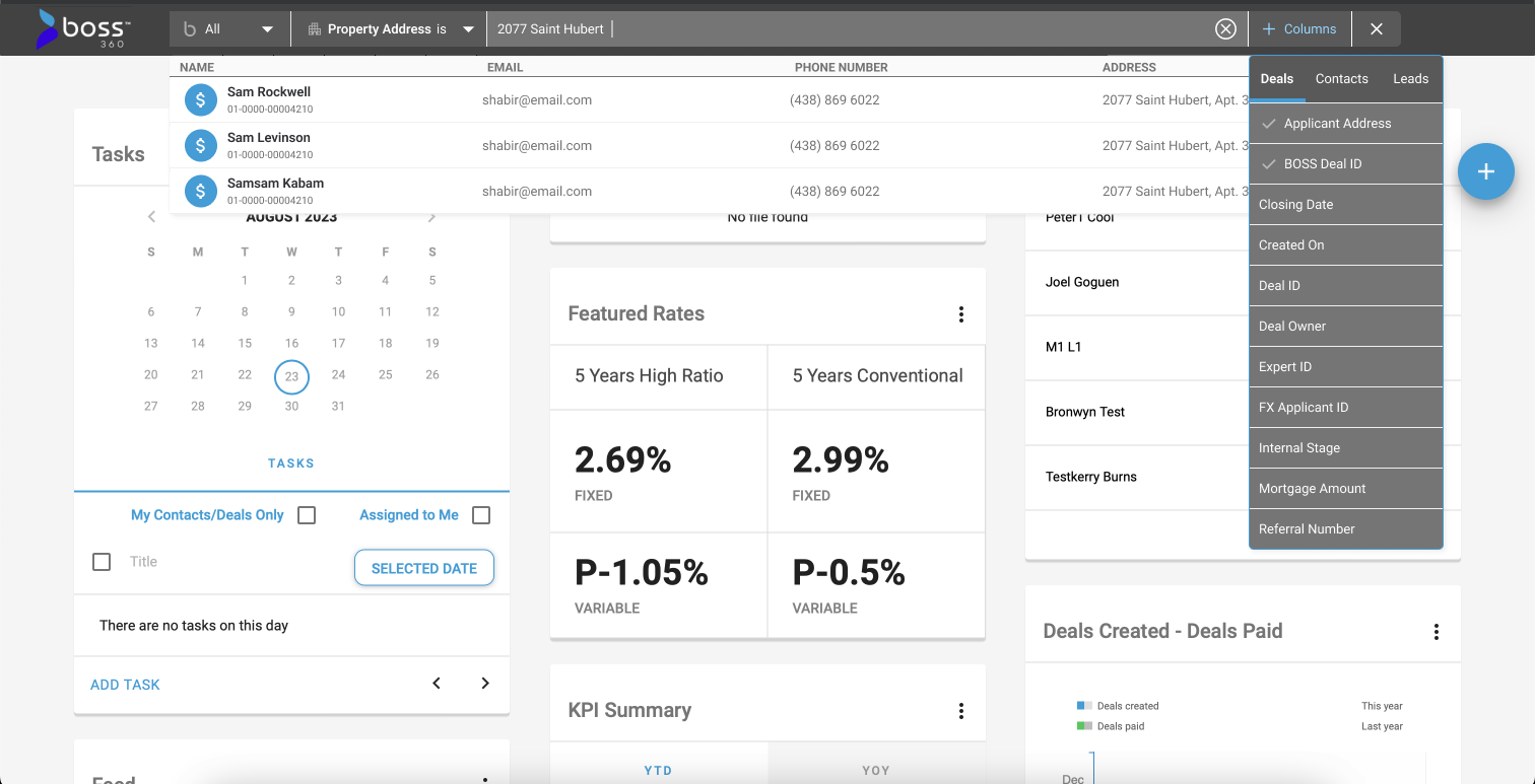
Eleven optional fields, scoped per record type — a Deal's columns (Mortgage Amount, Internal Stage) aren't a Lead's. The filter chip and the column picker were now clearly two different tools solving two different problems: narrow the list, versus choose what the list shows.
What actually went out the door
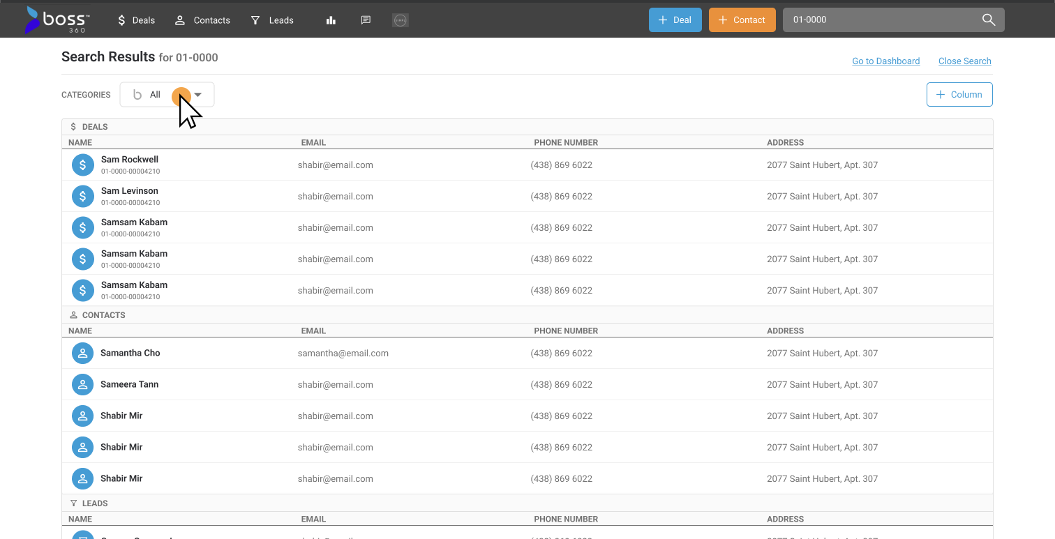
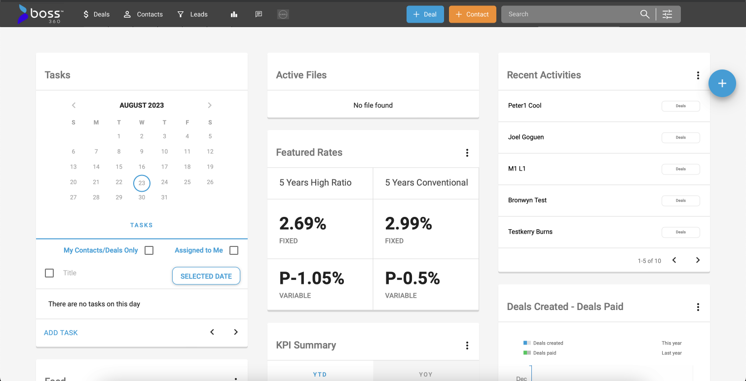
Everything above got cut down to four steps. No operators, no chained chips, no checkbox stack — and search got promoted from a shrinking dropdown to a page of its own.
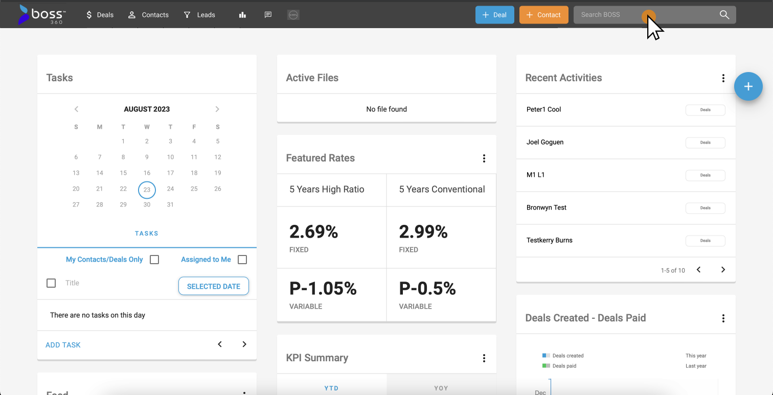
What survived four rounds
Grouping results by record type, and the "+Column" control to pick which fields show — both present in the very first exploration on Aug 3rd, both shipped almost unchanged.
What got cut
The operator-based filter chips (Round II) and the always-visible checkbox stack (Round I) — replaced by a single Categories dropdown. And the growing header dropdown became a real page, so results have room to breathe instead of scrolling inside 400px. The scope narrowed too: every round through Nov 23rd designed for three record types — Deals, Leads, and Contacts — but the live product searches only Deals and Contacts.
[ The Throughline ]
Reading the four rounds back to back, the project's real work wasn't inventing the query-builder in Round II — it was deciding, in the rounds after, that a mortgage broker shouldn't need to learn what "does not contain" means to find a client. The idea that survived from day one to launch day was smaller and quieter: don't make people guess whether they're looking at a deal, a lead, or a person. Everything else — the operators, the chained chips, the always-open checkbox row — was scaffolding the team built, used to find that one idea, and then took back down.
Two of the three original problems came out the other side solved: getting to a deal, lead, or contact no longer means leaving the page you're on, and every result now carries its category with it. The third — raw search speed — was a technical fix running in parallel to this design work, not something a results-page layout could solve on its own.