[ UX/UI Design and Research · January 2026 - June 2026 ]
Modernizing a Deal
Management Platform
[ 01 — Diagnosis ]
A Platform at Odds with Its Users
BOSS is a web-based deal management platform used by mortgage brokers to collect, enter, and review the full scope of a mortgage application — spanning multiple applicants, employment histories, income sources, assets, liabilities, owned properties, and complex mortgage structures — within a single workspace.
The existing platform had accrued considerable technical debt, major responsiveness issues, and had strayed from UX/UI design best practices. A full tech stack modernization became the opportunity to redesign the deal entry page in tandem.
The existing platform had significant technical debt, responsiveness issues, and poor UX/UI design practices. A tech stack modernization became the opportunity to redesign the deal entry page.
Four stakeholder priorities: improve UX/UI design and responsiveness, address high-priority pain points, formalize a design system, and maintain existing field density.
Key Considerations
Stakeholder Priorities
UX/UI Design + Responsiveness
Improve the fundamental UX/UI design of the deal entry page, including its responsiveness.
High-Priority Pain Points
Improve the design of select features identified as pain points during previous user interviews.
Design System
Formalize a modern, centralized design system across the platform.
Field Density
Maintain the flow and density of fields — brokers emphasized the existing format was essential to their mental model.
Constraints
Regulatory Requirements
Canadian mortgage applications have regulatory requirements (FINTRAC, CMHC guidelines, GDS/TDS ratios) that must be surfaced in the interface.
Change Management Risk
Previous redesign attempts were negatively received. Usability testing carried extra weight as a result.
Existing Workflow
Form structure was largely determined by the existing application workflow, not by designer preferences.
Brand Palette
Existing brand palette had to be partially maintained, despite accessibility concerns.
[ 02 — The Users ]
Expert Users with Minimal Room for Error
While the platform is used by a range of mortgage professionals, our focus was the mortgage broker — a domain expert who works with deal applications daily. They are not casual users. They know what every field means, and they expect the tool to keep up with them.
Cross-Cutting User Characteristics
Expert users who:
- Process multiple deals simultaneously and need to efficiently enter, review, and edit complex financial data.
- Within a single deal, context-switch consistently between applicant profiles, property data, and mortgage structures. Consequently, speed and data integrity matter more than visual simplicity.
- Operate under time pressure and work with financially sensitive data requiring accuracy.
Two user types: Senior Brokers (power users, high volume, speed-focused) and Broker Associates (detail-oriented, guidance-seeking). Both are domain experts who prioritize data density and accuracy over visual simplicity.
User Profiles
The Senior Broker
Manages multiple concurrent active deals; may be mid-entry on 5–10 files at once.
Maximum density. All qualifying ratios visible at all times. Fast tab-key navigation. No modal interruptions during data entry.
The Broker Associate
Works on fewer deals, more methodically. Often assists a senior broker rather than running files independently.
Clear field labels and inline context. Confidence that required fields are complete before submission. Visible validation feedback.
[ 03 — Process ]
Three Phases, Live Feedback
The project used an iterative draft model. Each phase was deployed to a live URL for real broker feedback on a working prototype rather than static mockups.
Component Library
MUI → Mantine migration
Existing design translated from MUI V0/V1 to Mantine, establishing the new component foundation for the redesign.
Standardized components, reduced noise
New component library applied with focus on improving visual hierarchy, standardizing components across sections, and reducing UI noise.
Navigation and Overview Panels
Overview bar moved to top
Deal overview bar moved to top of page to better reflect visual hierarchy of the application.
Collapsible sidebar
Sidebar made collapsible across screen sizes to reduce cognitive load and free real estate on smaller screens.
Sticky section banner with scroll sync
Section banner made sticky to improve orientation within the application; section headers synced with scroll position. Toggleable field legends moved to the sticky banner so they are accessible at all times.
Inline validation, no overlap
Validation drawer brought in line rather than overlapping, to improve field visibility while reviewing errors.
Side-by-side co-applicant layout
Co-applicant containers placed side by side where appropriate. Primary and co-applicant panels render side by side with distinct "Add Co-Applicant" and "Add Applicant Pair" buttons to prevent ambiguity.
Field Layout and Responsiveness
6–12 column field alignment
All fields aligned to 6–12 column grids for consistent layout and readability across sections.
Container queries over viewport queries
CSS container queries so field wrapping fires relative to card width. Essential: when the validation panel opens, the form width changes — viewport queries wouldn't respond.
Three phases deployed to a live URL for real-world feedback:
- Phase 1 — MUI → Mantine library update; visual hierarchy standardized
- Phase 2 — Sticky banner, scroll-synced sidebar, side-by-side co-applicant layout
- Phase 3 — 6–12 column field grids, container-query responsive layout
[ 04 — In the Field ]
What the Brokers Said
Testing Objectives
- To determine whether the updated design library and field positioning impacts users' data entry.
- To determine whether the updating or relocation of features implicated in red routes impact users data entry.
- To gauge overall emotional reception.
5 moderated remote sessions (~60 min each). 5/5 tasks completed; 5/5 called it an improvement; 3/5 density concerns.
- Redesign accepted without disruption across all participants
- Information density remains a constraint for review workflows (most acute in Liabilities)
- Live validation auto-clear signal needs stronger visual treatment
Five moderated remote usability sessions conducted with existing broker clients. Each ~60 minutes using a task-based, think-aloud protocol.
Test Tasks
All four tasks were completed successfully by all five participants. Key observations are noted below.
| # | Task |
|---|---|
| 1 | Create Applicant |
| 2 | Add Co-Applicant |
| 3 | Search Applicants |
| 4 | Validate |
What Worked Well
- Bolder, more distinct section headers reduced the "sections meld together" confusion reported with current BOSS
- Side-by-side co-applicant layout praised by 4/5 participants for data-entry workflows — makes applicant columns visually clear during phone calls with clients
- Live-updating validation (errors crossing off without re-triggering) described as "a nice feature" and "way better" by those who noticed it
- Validation panel no longer covers the form fields it refers to — EN1 called this out as a meaningful, specific improvement over current BOSS
- Click-through-to-error in the validation drawer was instantly understood by all five participants
- Collapsible deal overview navigation understood by all without explanation
- Save/Validate button position swap went unnoticed — nobody was disrupted
- Financial waiver placement in the deal header praised by EN1 as reducing the risk of agents missing it
What Needs More Work
- → Live validation auto-clear signal needs stronger visual treatment — 2/5 participants missed it and continued re-validating manually (addressed in Draft 19: more prominent corrected-state styling)
- → Address lookup fails on unit-number-first format (e.g. "Unit 49, 1760 Copperhead Drive") — existing BOSS bug, not a redesign regression, but frequently encountered
- → Search Applicants button not immediately visible on first scan for 2/5 participants — further discoverability investigation warranted
- → Fax number and Address Line 2 fields flagged as obsolete candidates for removal or de-emphasis
- → Missing ID types in Identification section: Provincial ID card and PAL (firearms licence) are requested frequently in certain regions
Key Findings
Redesign accepted without disruption
All five participants called the new page an improvement. Nobody was blocked or disoriented. Bolder section sub-headers were singled out as making the page easier to scan. The deal overview and financial bar split, and the collapsible deal navigation, were understood by all without explanation.
Information density is a real constraint for review workflows
Three of five participants want more content per screen. Pain is most acute in Liabilities, where a refinance with 10–20 debts forces extensive scrolling. FR1's second-monitor document-review workflow is directly degraded by the side-by-side layout once both applicants are entered — a tension between entry (better side-by-side) and review (better full-width stacked).
Live validation behaviour needs a stronger visual signal
Two participants (FR1 and EN1) continued to hit "Validate" after each correction, not realising the list was already updating live. The auto-clearing behaviour was noticed and praised by EN2 and EN3, but the corrected-state styling was not prominent enough to break the existing mental model.
[ 05 — After Testing ]
Redesigned in Response
- Single-row liability entries to maximize rows per viewport
- Review mode toggle for document-review workflows
- Prominent corrected-state styling in the validation drawer
[ 05 — Iterations from Testing ]
Redesigned in Response
Single-row liability entries + global padding tightening
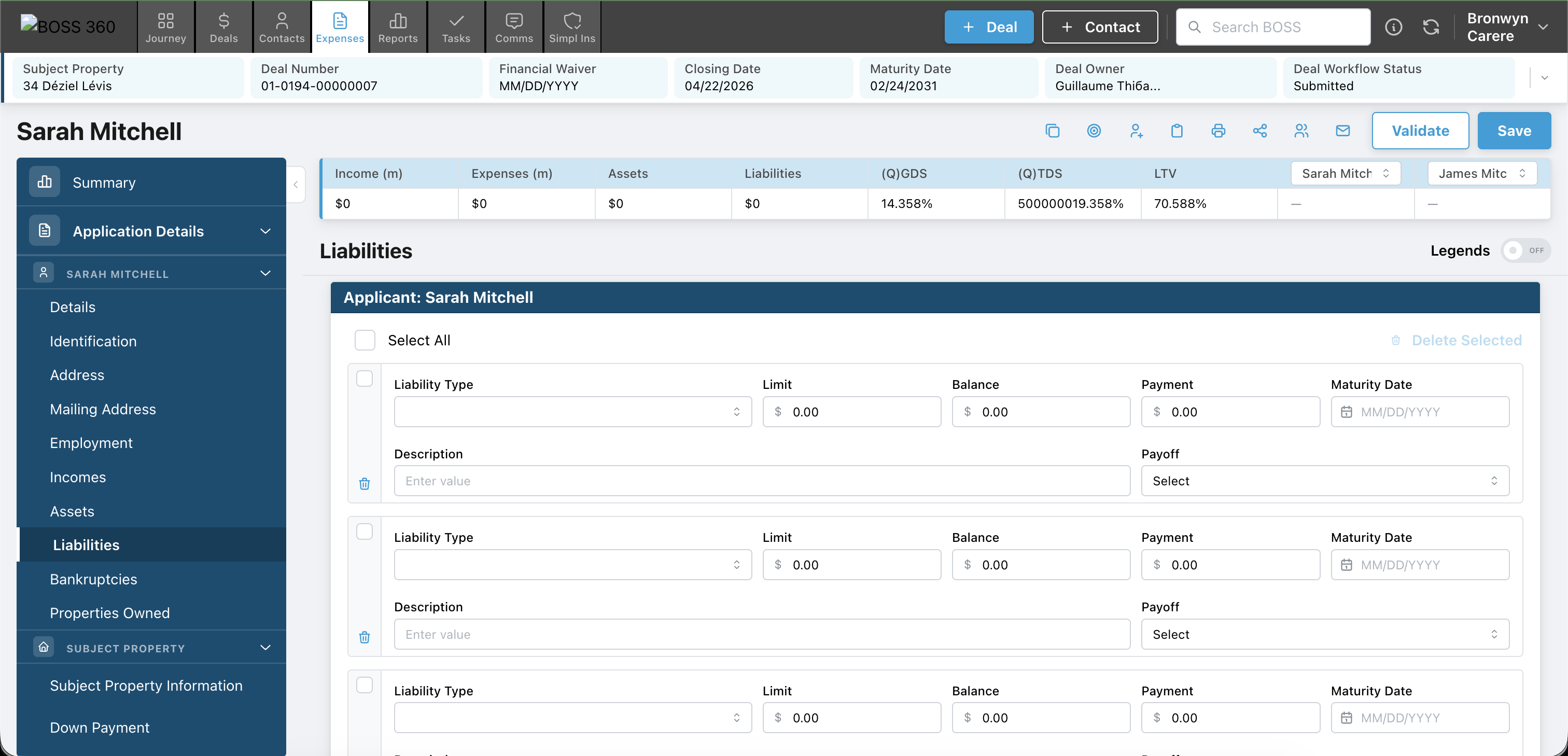
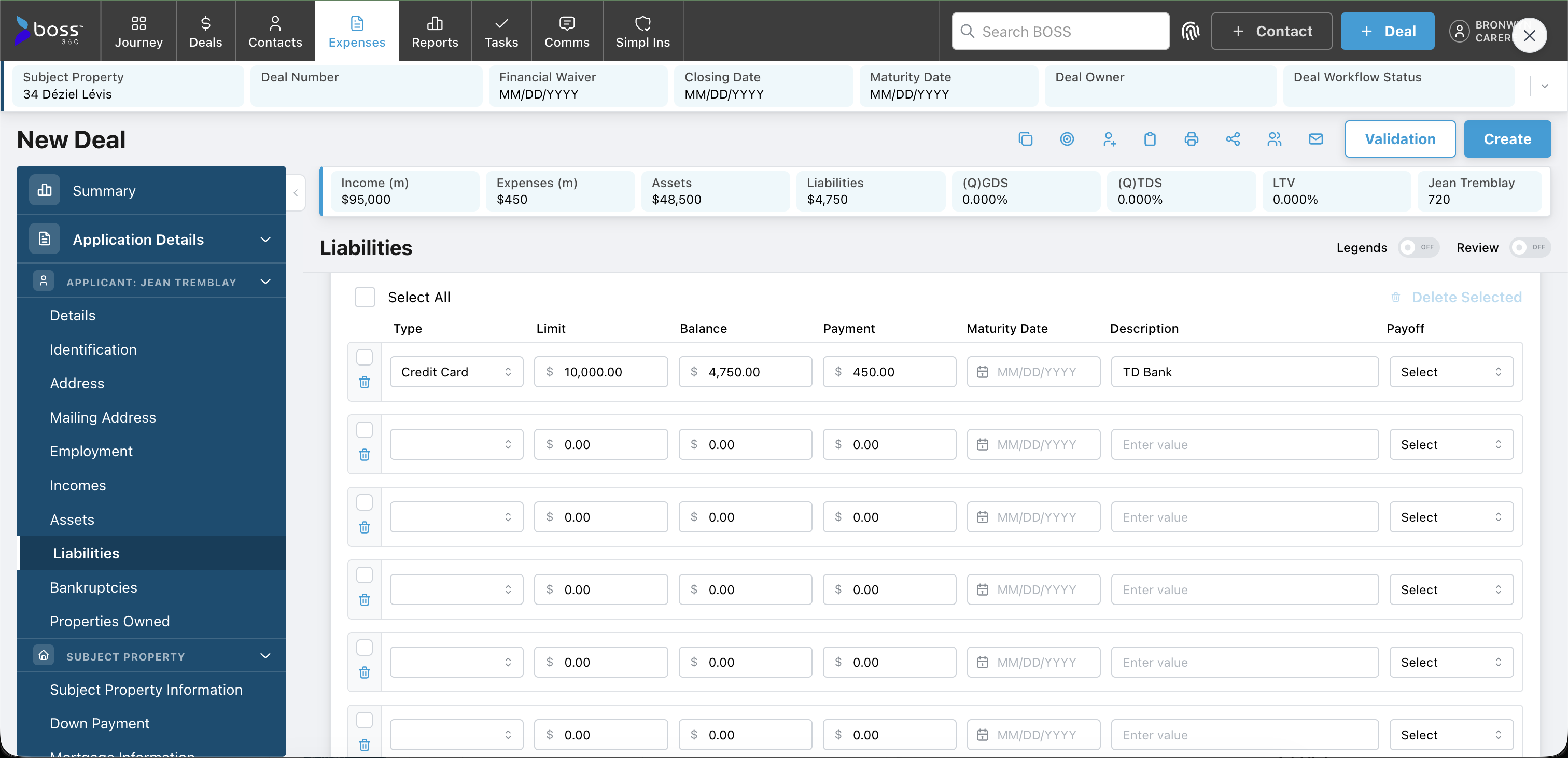
Finding: 3/5 participants wanted more rows visible per screen, most acutely in Liabilities (10–20 entries). Change: All 7 liability fields collapsed onto one line per entry, margins and padding tightened globally. Outcome: Refinance deals with 10+ debts now expose significantly more rows per viewport.
Review mode toggle in multi-entry sections
Finding: FR1's document-review workflow (source doc on second monitor, form on left) degraded once both applicants were visible side-by-side. Change: A "Review" switch strips form styling to show data only in a compact, scannable layout. Outcome: Entry users keep side-by-side; review users can switch to full-width read-only view.
Prominent corrected-state styling in validation drawer
Finding: FR1 and EN1 continued to re-trigger validation manually after each correction, not noticing validated items were already clearing live. Change: The "corrected" state made visually distinct — strikethrough text + green check icon. Outcome: Auto-clearing now reads as a visible state transition, reducing redundant re-validation clicks.
[ 06 — Looking Ahead ]
Unfinished Business
The current prototype covers the full UI surface with mock data. The next phase will introduce real system integration and close remaining design gaps.
- Re-test the design — specifically the Review mode toggle for scannability and the improved corrected-state styling for live validation clarity
- Resolve the side-by-side vs. stacked tension for document-review workflows — consider a user-level preference or section-level toggle
- Group participants by user type for future usability rounds — test within cohorts (e.g. high-volume entry-only vs. team-lead reviewers) for cleaner findings